
Ad Trends for 2020 vs 2019

Rich Keller • June 22, 2020
"Ad Trends 2020 vs 2019?" infographic

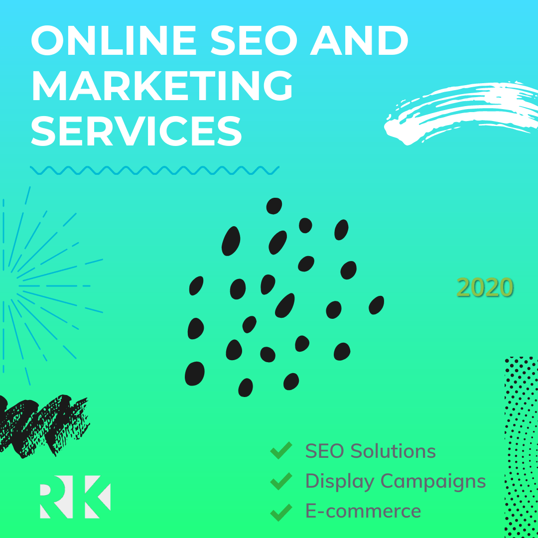
Leading up to 2019, a simple ad used for the various platforms, routinely looked the same. The headline above, smaller tagline, with huge CTA bottom right or left. Then, the "pièce de résistance", the stock photo background to show just how lazy, I mean professional you actually are. Well, the Trend in 2020 is the same in regards to the headline, tagline and call to action, but the pointless stock photo background had given way to the pastel gradient, and pointless lines and random illustrations. Trading pointless stock photo for pointless shapes and blobs. The only benefit I see is the viewer may just read your message instead of wondering where they've seen that generic hand holding a phone before. 😋
Feel free to use this infographic on your site, blog or social posts. Just be nice and add a link back 👍Download as PNG

10 Things Digital Marketers Say (And What They Actually Mean)

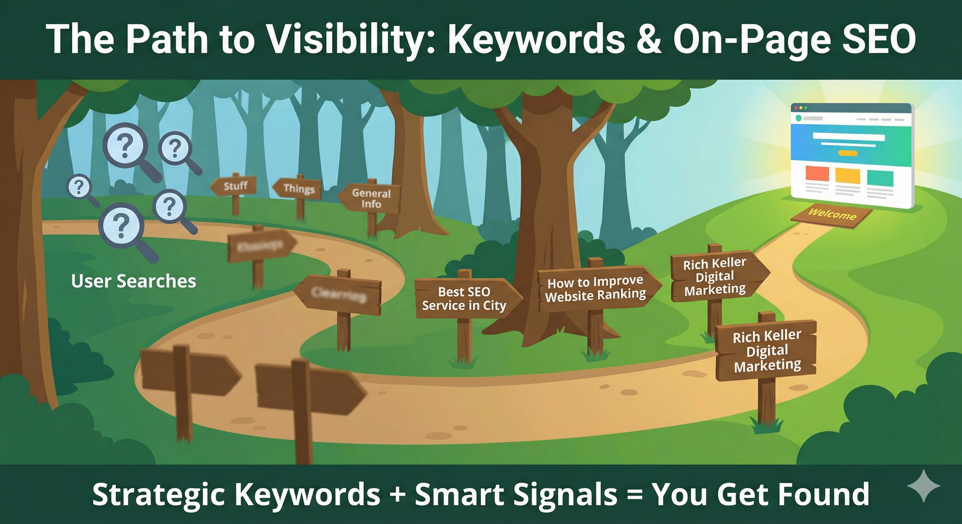
What is AEO? The Evolution from SEO to Answer Engines
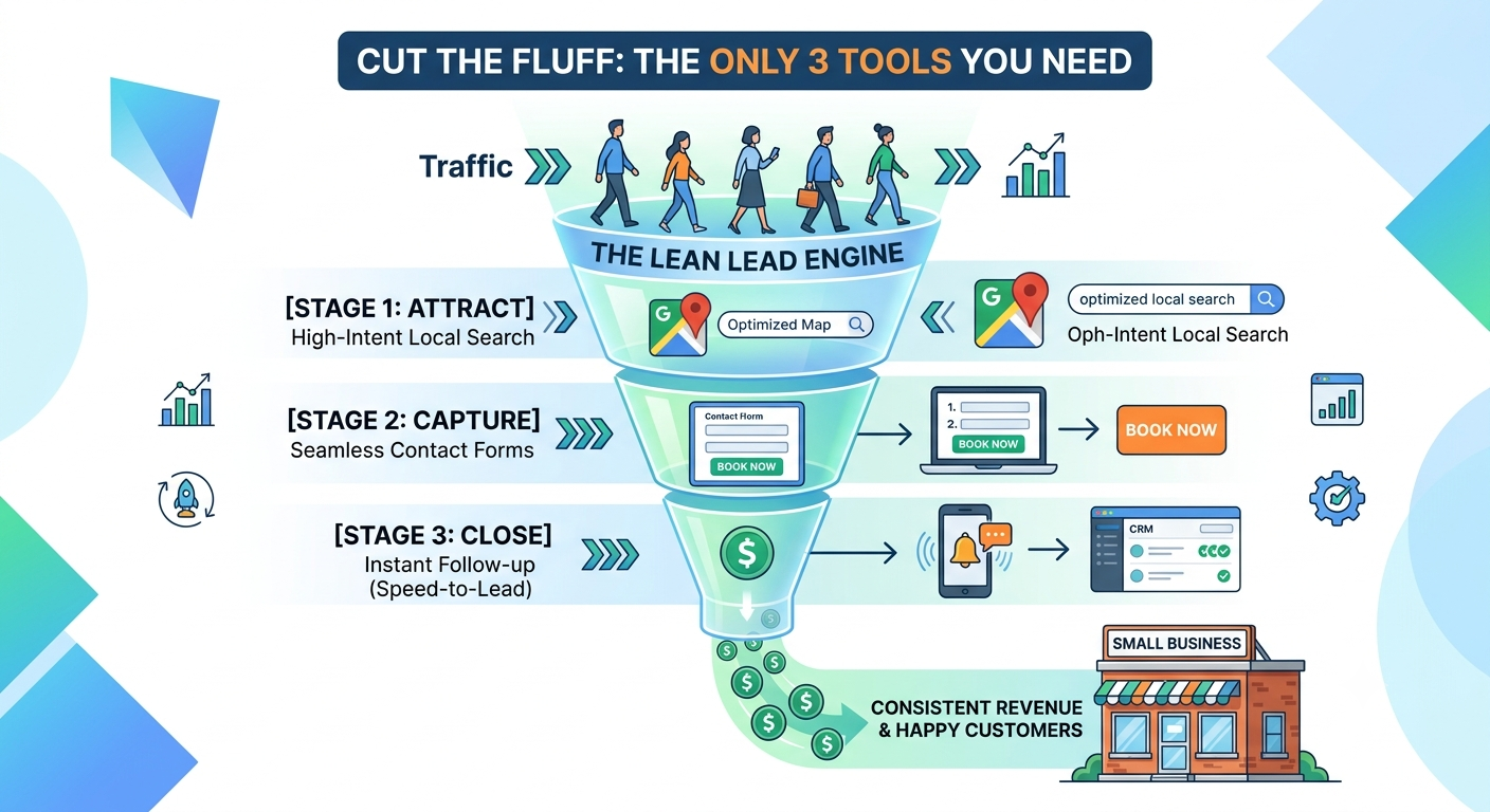
Stop Buying "Features" and Start Buying Customers: The Lean Tech Stack Rules
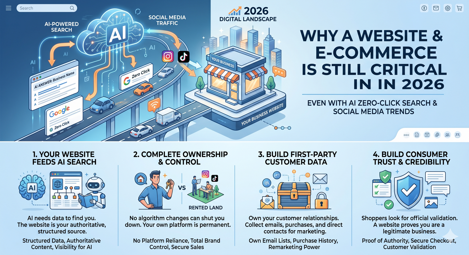
Why a Website (and E-Commerce) is Still Non-Negotiable in 2026 (Even in the Age of AI Search)

The Top Ten: Are You Flying Blind? (Part 5 of 5)
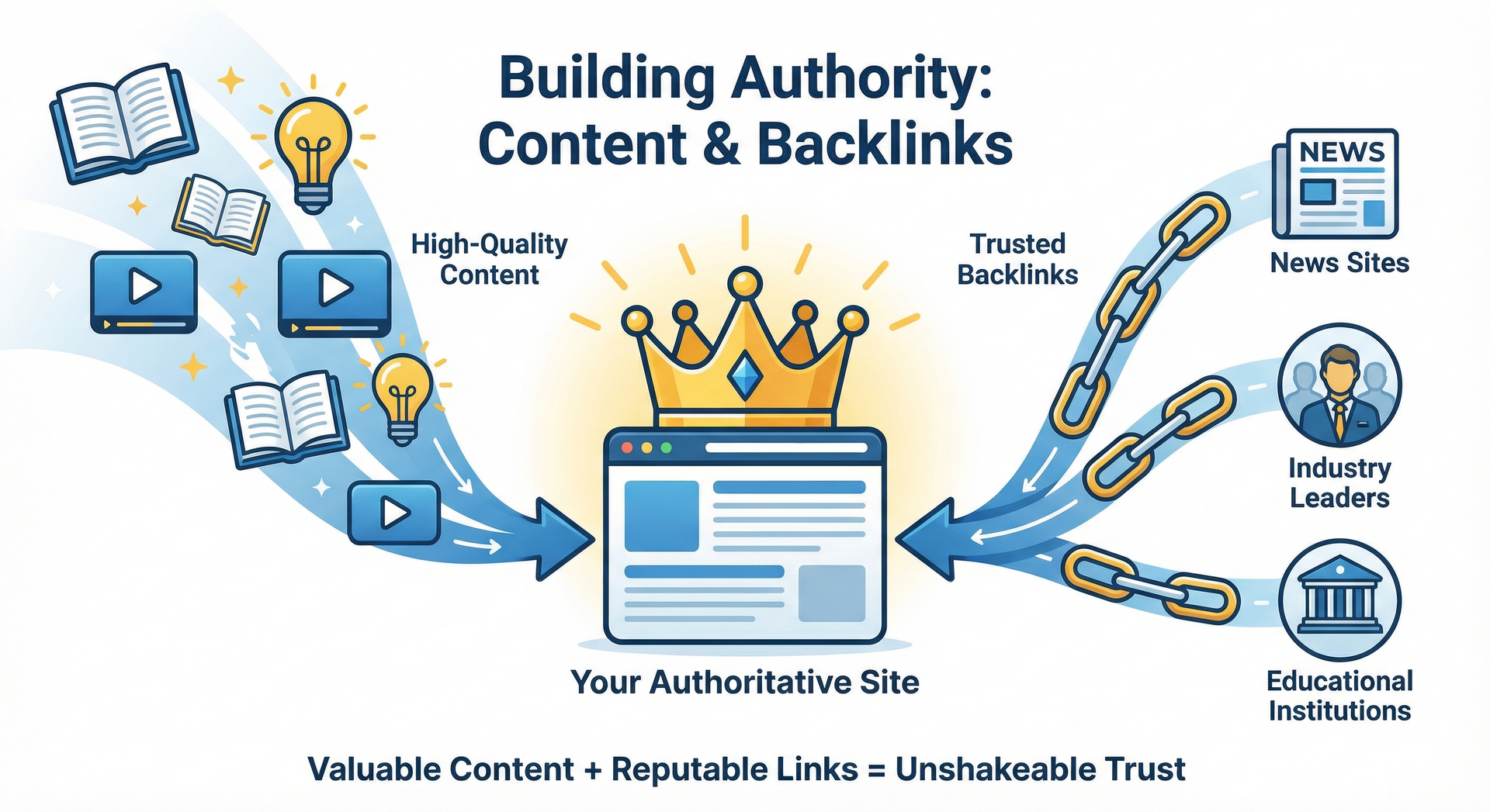
The Top Ten: How to Prove You're the Expert (Part 4 of 5)
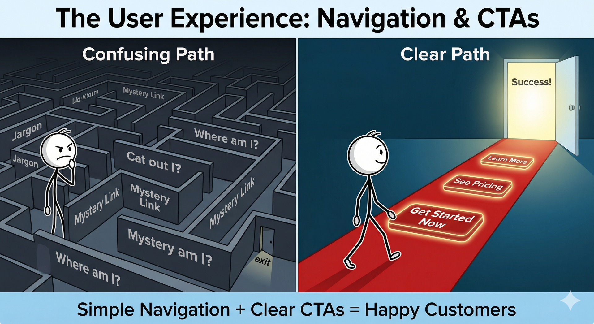
The Top Ten: Is Your Website a Maze or a Welcome Mat?
The Top Ten: Are You Speaking Your Customers' Language? (Part 2 of 5)

What "I Build Websites" Means in 2026
Cost-Effective Turnkey Solutions at Just $149/month.
Transform your online presence with Rich Keller.
Starting at $149/month, you receive:
- Professional Website
- AI Tools for Writing
- SEO Optimization
- Digital Marketing Services
- Unlimited edits.